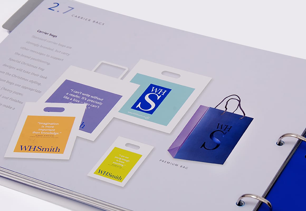
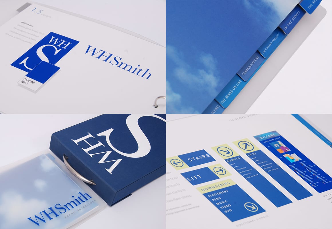
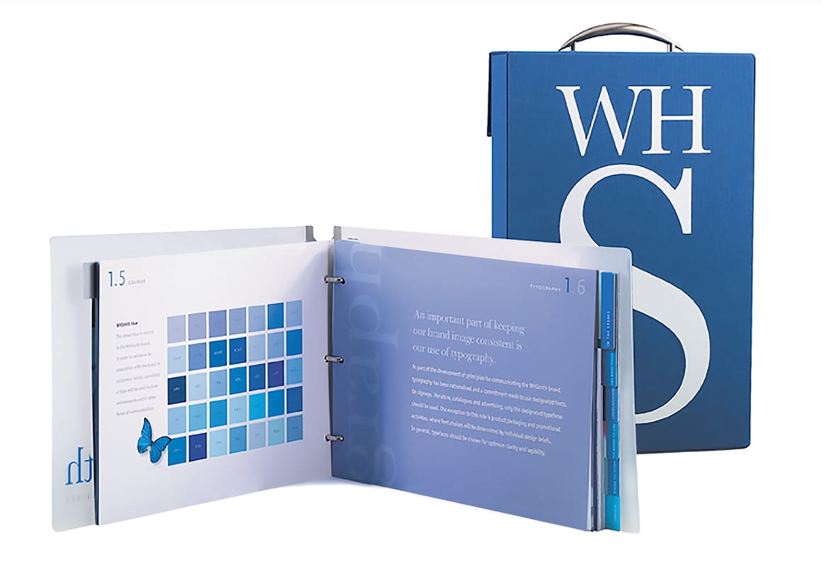
Creating brand guidelines for an organisation as complex and broad reaching as WHSmith was a challenge!
A strong visual identity was already in place, but what was lacking was a rigorous set of guidelines for its usage across the increasingly diverse channels where the brand appeared – from the main store estate to specialist store formats, its online presence, its news distribution division, corporate communications and much, much more…
More than simply producing a set of rigid usage rules, this was also an opportunity to set out the principles of the brand’s personality, its tone of voice and its raison d’être. We wanted to create a document that any new employee could read in less than half an hour, and come away with a clear sense of what the WHS brand stood for.
Laid out in clear, easy-to-navigate sections (and delivered in a box heavy enough to threaten rule breakers with!) the guidelines immediately proved to be a valuable tool right across the business. Establishing the ground rules about the visual brand gave internal staff and external agencies a clear understanding of the visual brand’s mandates, which ensured a consistency that strengthened its impact.


