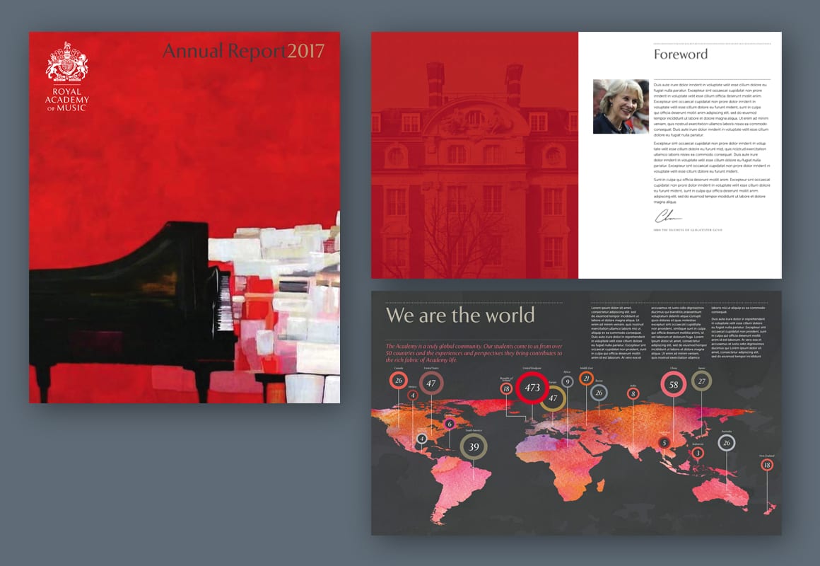
We worked with London’s Royal Academy of Music on a review and refresh of their branding in 2018. This was an exercise that was less about bringing about dramatic change, and more about understanding how the organisation was using its visual branding, and exploring ways to strengthen the brand. Our brief was to make recommendations on how to promote visual consistency to ensure communications reflected the standards of excellence of the world’s no. 1 music conservatoire.
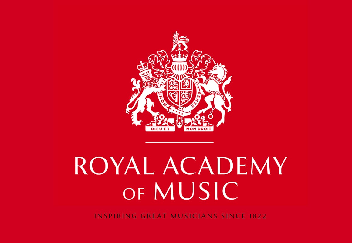
Our recommendations began with a reworking of the RAM coat of arms – a mark that had been causing issues with reproduction and which had several versions in use. Our redraw simplified the mark, and different versions made it work better at scale. We introduced a new range of font families and developed specific ‘lock-ups’ of the mark and wordmarks, thereby ensuring rigorous consistency of usage.
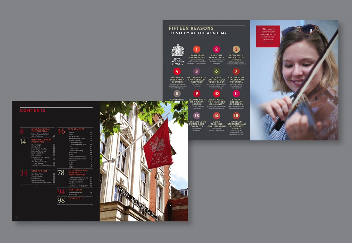
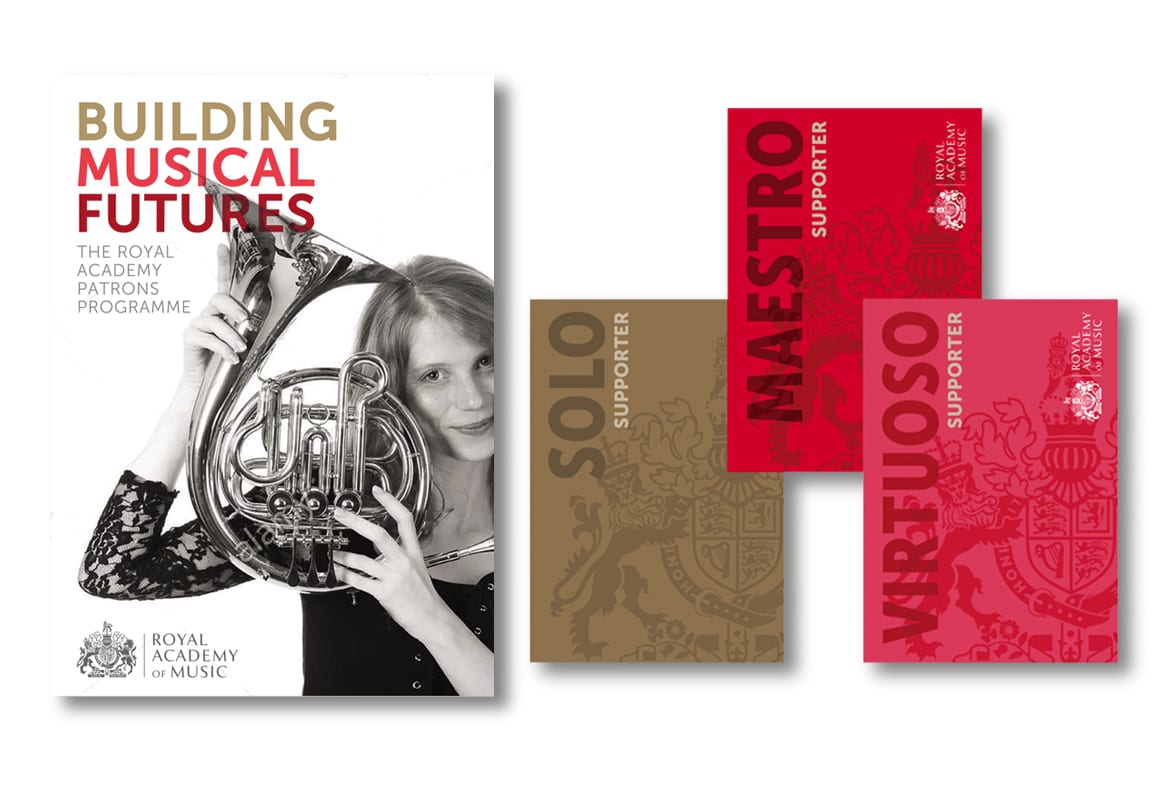
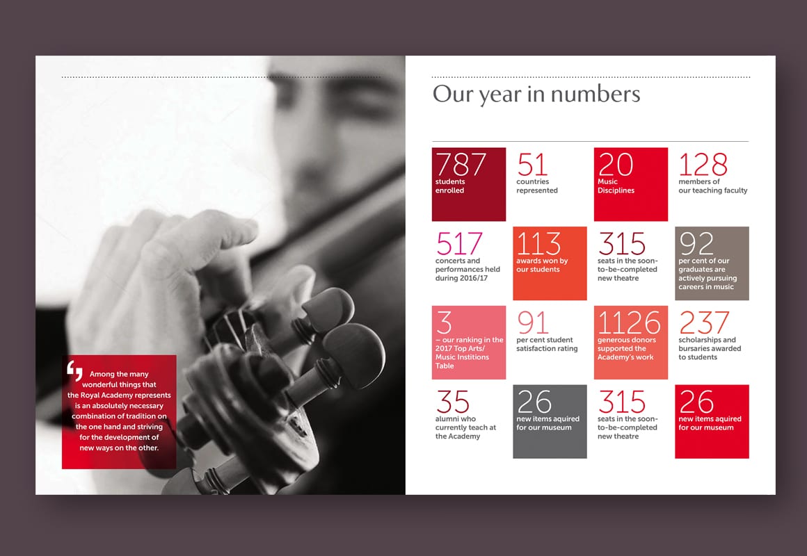
As well as developing new colour palettes, image treatments and graphic motifs we also created a range of templates for publications, internal comms and signage.
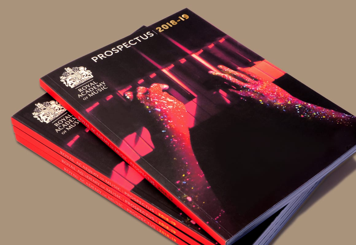
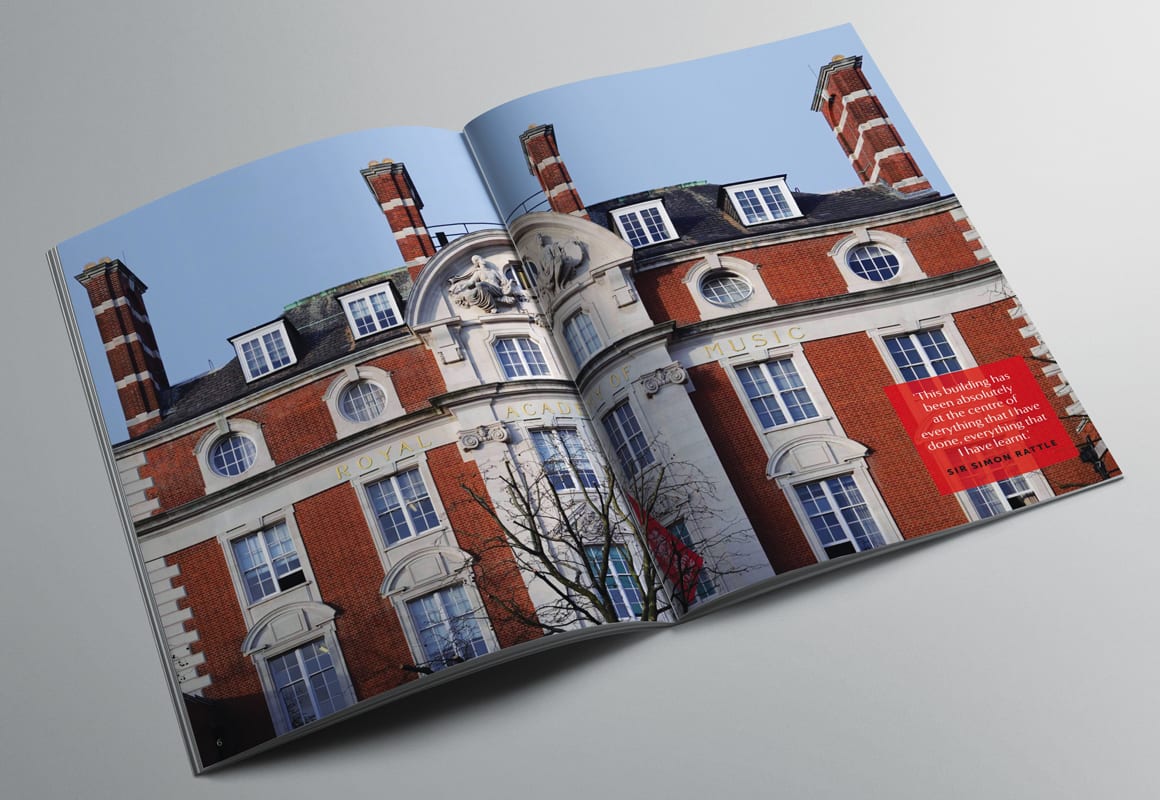
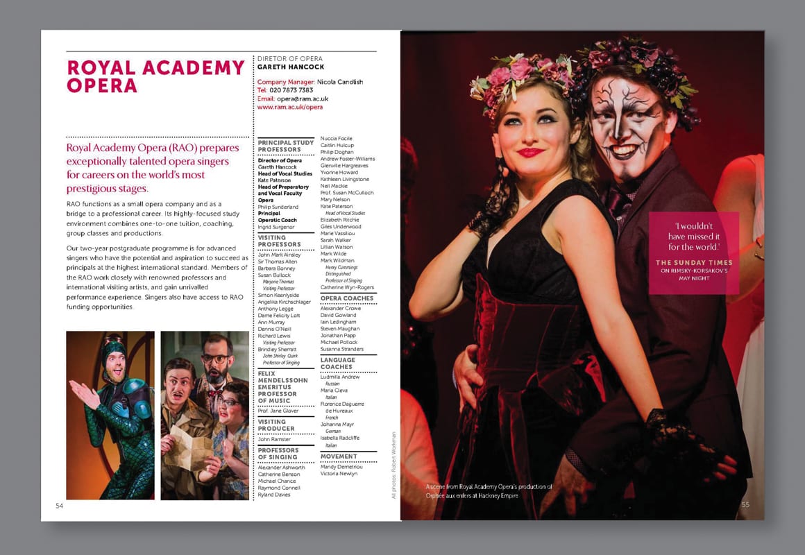
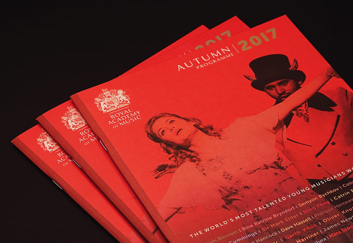
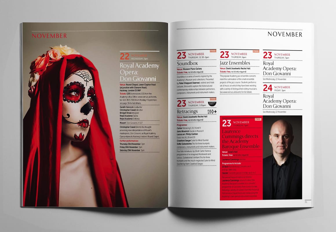
We developed new styling for the Academy’s prospectus, giving it a more contemporary and student-centric feel. We also designed new templates for the termly programme of concerts that the Academy runs throughout the academic year.

